We Rebuilt the Base Score. Here's What 261,000 Trades Told Us.
Over the last few weeks, we rebuilt QualliScan’s base score using 261,000 historical breakout trades and six years of data. The process forced us to confront a tension I hadn’t expected — win rate and winner magnitude pulling in opposite directions — and ultimately produced a scoring architecture that’s structurally different from anything we’d tried before.
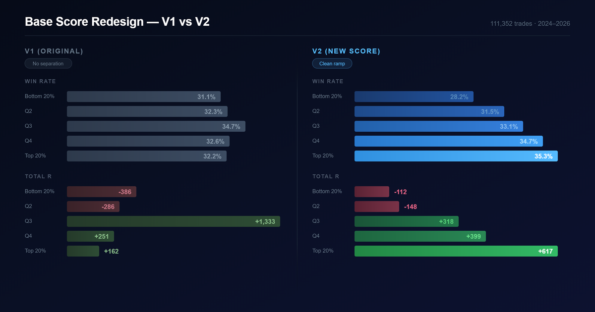
The top quintile now generates nearly 4x the expected value of V1. Win rate separation across deciles went from flat to a clean 28%–35% ramp. But the path to get here wasn’t what I expected.
Where V1 started
The original score was hand-tuned. Twenty sub-components across five buckets: momentum, base quality, volume and supply, structure, and context. I set the thresholds and weights based on what I’d learned from studying charts and cross-referencing with strong setups identified in the Qullamaggies Discord. It worked well enough to ship. But after running the scanner for a while, I wanted to know whether the data agreed with my intuition — and where it didn’t.
What the data said
We backtested 261,000 breakout trades from January 2020 through April 2026 and measured how well each of the 174 features in the system actually predicted trade outcome.
The first surprise: about 20 of the 100 points in V1 were allocated to features with near-zero predictive power. Tightness composite had 8 points — its correlation with outcome was essentially zero. Linearity score, same story at 8 points. The accumulation indicators (CLV, A/D line, OBV) had 4 points combined, all noise. A fifth of the score was dead weight.
The second surprise was relative strength. RS percentiles were the single largest component of V1. Turns out RS is useful as a universe filter — it helps decide which stocks to scan in the first place — but once you’re already looking at breakout candidates, it doesn’t separate the good setups from the bad ones. Within the pool the scanner surfaces, RS had almost no differentiating power.
The third surprise was what we were missing entirely. Sector and industry context — things like the percentage of stocks in the same sector making new 20-day lows — showed up among the strongest predictors. When the sector is falling apart, breakouts fail more often regardless of how good the individual pattern looks. The entire category was absent from V1.
And then there was the misleading stuff. The two features that statistically dominated everything — stop distance and reward-risk ratio — aren’t measuring setup quality. They’re measuring trade geometry. A tight stop mechanically produces a higher R-multiple if the trade works. That’s math, not edge. A pattern quality score needs to measure the pattern, not the position sizing.
The tension we couldn’t optimize away
This is where the project got interesting, and where the easy answers stopped working.
We built separate scores — each optimized for a single objective — and looked at how they ranked the same trades. What came out was unmistakable: win rate and winner magnitude are opposed in breakout trading.
When we optimized purely for win rate, it sorted setups beautifully by win frequency but did the opposite for winner size:

A 9 percentage point spread in win rate, but the worst-scored setups produced bigger average winners than the best-scored ones. The winners were rarer at the bottom but explosive when they hit.
When we optimized for winner magnitude, the inverse happened:
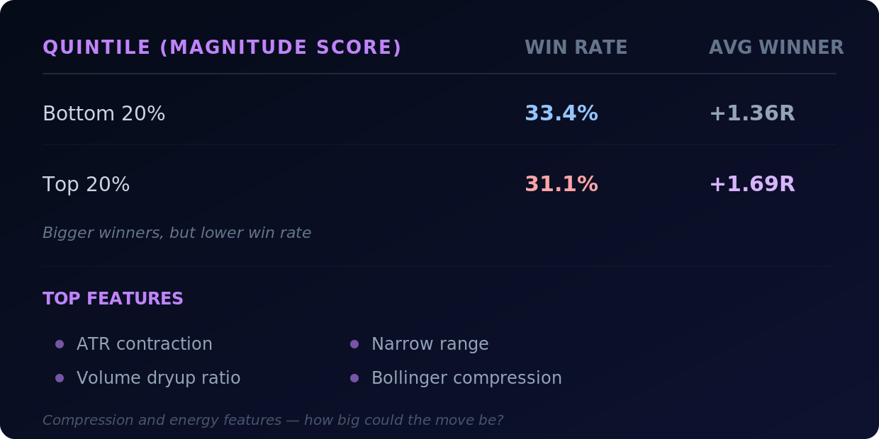
Bigger winners at the top, but lower win rate. Two different families of features pointing in two different directions.
Win rate liked sector health, overhead supply, base duration, orderly right-side action. Magnitude liked ATR contraction, dryup ratio, narrow range, Bollinger compression. The features driving each score were almost completely different.
The naive next move was to blend them — weight both sets of features into one score and let it find a middle ground. We tried it. The result was mush. Modest slopes in every dimension, nothing meaningful at the top, no clear separation. Averaging away a real conflict produces a score that does neither job well.
The tension is structural. Longer, cleaner bases in healthy sectors win more often but move less. Tighter, more compressed setups explode bigger but break down more often. You can’t collapse “is this trade likely to work?” and “if it works, how big will it go?” into a single weighted average without losing the signal that mattered in each.
A different architecture
Once we accepted that the two signals couldn’t be blended, the question became: how do you put them together without averaging them?
The answer was to give features roles instead of weights.
Permission features decide whether a setup is allowed to compete. These are the safety and context signals — how healthy the industry is, how much overhead supply sits above the breakout level. They act as a soft gate. Strong context multiplies the rest of the score; weak context discounts it heavily.
Ranking features decide where a setup lands once it’s cleared the gate. These are the compression and energy signals — the coiled spring (volume dryup combined with ATR contraction), narrow range, right-side velocity. They’re the main driver of where a stock shows up in your scan, but only after the gate has decided the setup is worth ranking at all.
Orderliness features are a small capped bonus. Base duration, RS slope, MA stack alignment — past a threshold they don’t keep adding score. They reward clean structure without dominating the sort.
Geometry features (R/R ratio, stop distance) are capped at a tiny three-point tiebreaker. They’re real information, but they measure position structure, not pattern quality. Capping them prevents the score from collapsing into a “tightest stop wins” sorter.
The key insight: compression in a weak setup is just noise. Compression in a clean base inside a healthy sector is a coiled spring. A blended score gives both cases similar marks. The role-based architecture doesn’t — the gate decides whether the compression signal even gets to count.
The results
On the out-of-sample test set (2024–2026, 111,000 trades the optimizer never saw):
Top quintile (highest-scored 20% of setups):
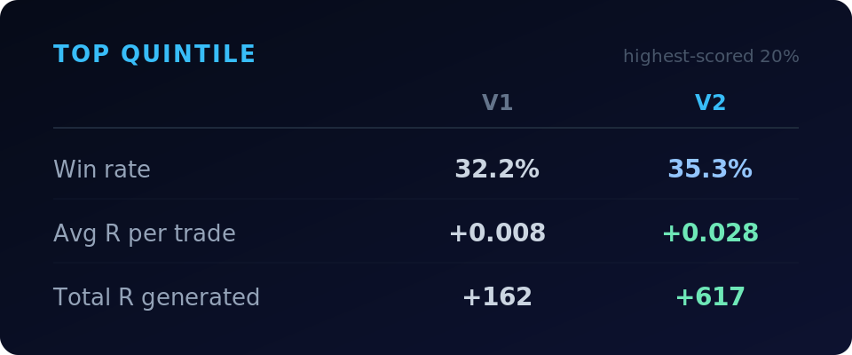
The top quintile generates nearly 4x the total R of V1, driven by a 3.1 percentage point improvement in win rate and a meaningful drop in losing-trade severity.
Bottom quintile (lowest-scored 20%):
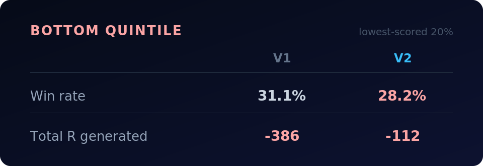
V1’s top and bottom quintiles had nearly identical win rates — a 1.1 point spread. V2 separates them by 7.1 points. It’s actually ranking setups.
Win rate across deciles ramps cleanly from 28% at the bottom to 35% at the top four deciles. V1 was essentially flat across the same range — it couldn’t meaningfully separate winners from losers on this dimension.
What the score doesn’t do
The biggest winners — the 5R, 10R, 20R trades — are dispersed throughout the score range. They’re hard to predict and don’t cluster at the top. That’s the structural tension at work.
What the score does predict is expected value — the combination of win rate and typical outcome that determines whether a trade is positive expectancy. The top quintile is clearly positive. The bottom is not. That’s what a ranking score needs to do: get the names worth studying to the top of your scan and push the weaker setups down.
If you want to screen for explosive potential specifically, the compression features are there in the scan data — ATR contraction, dryup ratio, Bollinger bandwidth. The score tells you whether the setup is sound enough to act on. The compression tells you how big the move might be if it works.
What’s next
The new score is live in the scanner and computing on every daily and weekly scan. Historical scores have been recomputed across the full database.
The role-based architecture opens up things we haven’t explored yet — regime-aware gate thresholds, interaction terms between context and compression, different bonus weights for different market environments. There’s still room to improve, and the dataset starts in 2020, so it’s mostly bull market and a few corrections. Seeing how the score holds up through a prolonged bear market or a sideways grind would add confidence.
Alongside the score redesign, we’re launching the /trades page. It shows every trade detected by the breakout scans — both historical and currently open — with all data point-in-time as of the breakout date. You can filter trades the same way you filter scans. Right now exit logic follows the 10 or 20-day moving average, and stops use the low of the pivot (LOD stop coming soon). The next step is extending the timeframe and letting you backtest portfolio strategies against the trade data — simulating different entry filters, position sizing, and exit rules. More on that soon.